
I heart comics! Every Wednesday I happily skip to my local comic book store to pick up the latest issues, bag and boarded please! Writer Ken Pontac likes to have them "naked" for his perverse pleasure. Oh, the poor, unprotected issues! Anyway, I'm constantly enthralled, thrilled and entertained by super-heroes. So, for the third member of the Ka-Pow! series, it's only natural that we tap into our resident super-hero squirrel, Splendid! Truth be told, Splendid's inclusion in the Ka-Pow! series was a last minute addition. When I was pitching the show to the powers-that-be there at Mondo Media I only had ideas to flush out Flippy and Buddhist Monkey and actually just came up with the concept for Splendid on the spot! (Yikes, don't tell my boss!) Luckily, they trusted the team to see the thing through and we managed to come up with a really great show.
Roque Ballesteros from Ghostbot has the Director's chair on this one. He's been in the Happy Tree Friends hot seat before helming the award winning Mole In the City episode we did a few years back. Aching for more punishment, he's back to tackle the heroic rodent.
All the usual suspects were involved in the writing; Ken Pontac, Warren Graff, and myself joined forces with Alan Lau, Brad Rau and Roque to hammer out my last minute pitch into an actual show. As typical in these comic book team-ups, we fought at first and found that we were equally matched. However, all parties came together in the end to fight the real bad guy... cheese! Yeah, that's right. You know what I'm talking about... don't pretend like you don't. I'll let that one sink in before we continue...
Once again, we needed a unique look for Splendid's SSSSSuper Squad that was similar but different (that's the kind of art direction I like to give, clear and vague at the same time!). While still working on W.A.R Journal and Buddhist Monkey, I asked Roque for a rough sketch of what Splendid could look for promotional purposes. If you know Roque, getting a rough anything from the man is next to impossible! So, the request for a loose idea turned into a finished, gleaming piece of art. Thus was born the mighty Splendid!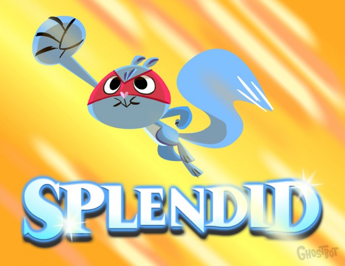
Although the title graphic may have changed, as you can see from the actual design (below) in the show, not much is different the original image. There was some minor tweaks that I asked Roque to make like giving him a broader chest (less pot-belly) to really push that heroic posture and image.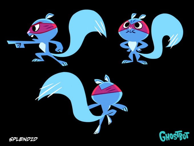
At this point he's ready to... hey, wait a minute! Where's his wings???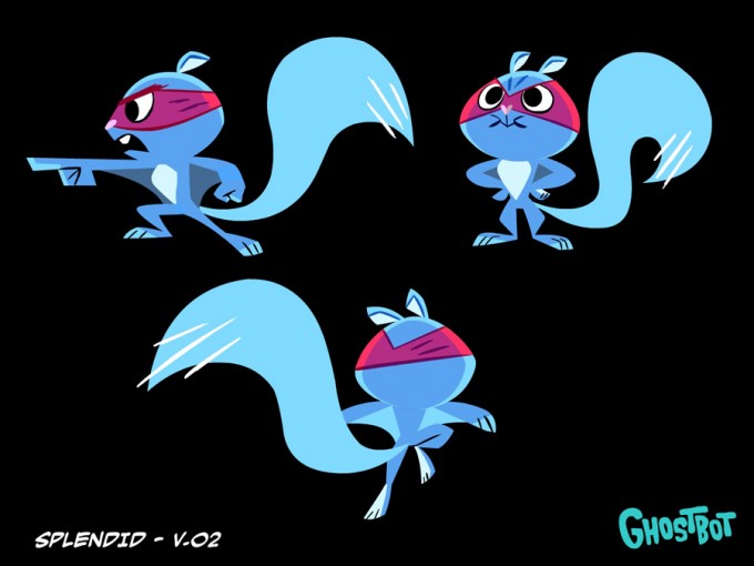

Nice try, Ballesteros! He tried to float Splendid through me without his wings! Like the eye of Sauron, I see all!!! Well, maybe, I see a lot... ok, I'm blind as a bat. However, my sense of smell has never been wrong!
Anyway, the two images above, are two versions he sent after I called him on his shenanigans. Version 3 has a more visually colorful wing design but I ultimately thought it was too distracting and opted to go for version 2 instead. Up, up and... um... I can't remember how that ends.
Once we got our final design for Splendid it was an easy step to get to Splendont, his arch-enemy!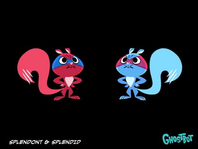
I've had the idea for Splendont ever since we did the T.V. series but never got a chance to really use him in an episode. Since the direction for the new series was bigger, badder, and more epic the introduction of Splendid's arch-nemesis was a no brainer. Playing off classic themes we toyed around the possibility of giving Splendont a gotee, like Spock in the Mirror, Mirror episode of Star Trek from which we named the first episode after. That suggestion died very quickly after seeing how silly Splendid looked with a gotee.
Another idea was to riff off Bizzaro, who has a great hook to his character being the exact opposite of Superman. Ultimately, I really liked the simplicity and visual of reverse colors like The Flash and Reverse Flash so, that's the direction we went with.
I really LOVE The Super Friends and wanted to assemble a league of heroes for Splendid. One hero is a good time, but a whole team... that's a party! We held out the reveal of the other heroes until the end of the first episode as a cliff-hanger to get people pumped up that we're going to be blowing the doors from this world and introducing a whole slew of new whacky characters.
Unlike Roque, I have no pride and since I've already embarrassed myself in early posts when I showed you completely rough and totally bad sketches, I figure I'm already in for an inch and I might as well go for the whole yard! Below are the TERRIBLE (I just shake my head) sketches I sent Roque when we were discussing some of the characters. I'm baring my soft, weak, ticklish spot for you people!
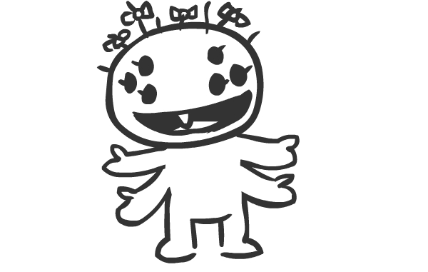
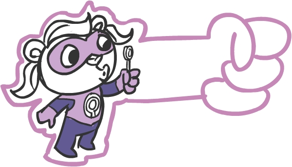
Since the last shot of the heroes was fairly quick and we didn't get to clearly see them all, I'm posting them again here in all their glory!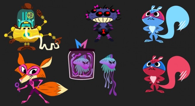
I'd give away their names and describe them to you now... but that would ruin some of the surprises we've got in store. So, for now, just revel at how awesome they turned out! As you can see, Roque worked his magic on my dumb sketches and totally turned garbage to gold! I'm really looking forward to flushing these guys out and featuring them in future episodes. We were all cracking up quite heartily when we came up with some of these guys so, hopefully, you guys will get a few chuckles as well when we finally see them in action.
And speaking of a few chuckles...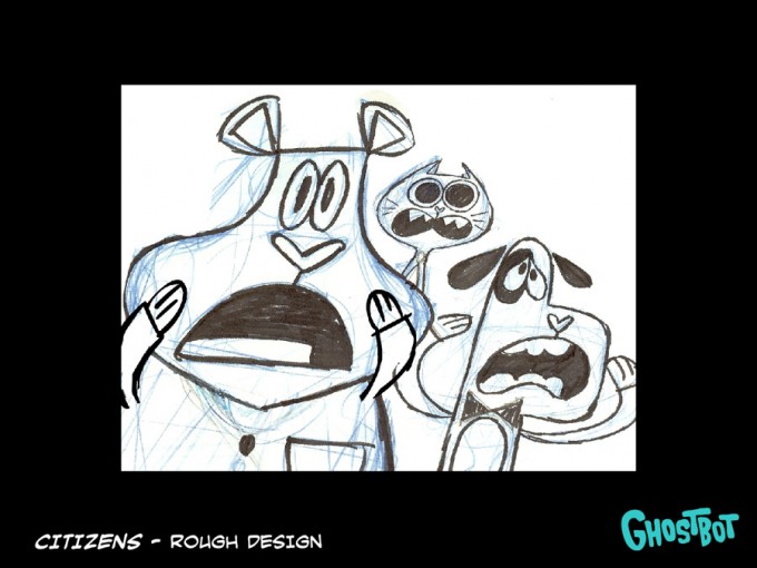
These citizens that constantly needed saving turned out to be really hilarious and was actually born out of budget and schedule conflicts. We basically didn't have the time or money to create a whole slew of characters for every time there was an accident that required some innocent bystanders. So, we just went the opposite direction and totally embraced that fact that they just magically showed up at EVERY SINGLE catastrophe! It turned out to be quite funny so, look for these three to show up in more episodes whenever somebody needs saving.
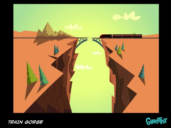
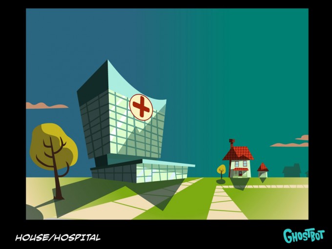
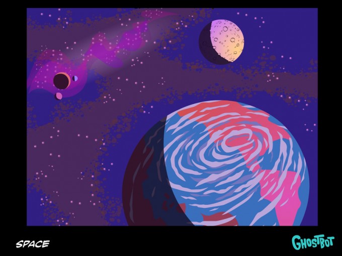
The unstoppable team of Brad Gake and Leticia Lacy are back yet again to amaze and dazzle us with their "splendid" background designs and colors! These images are so awesome I feel like they should be hanging on a wall. I won't let words ruin it, just browse and appreciate them at your leisure.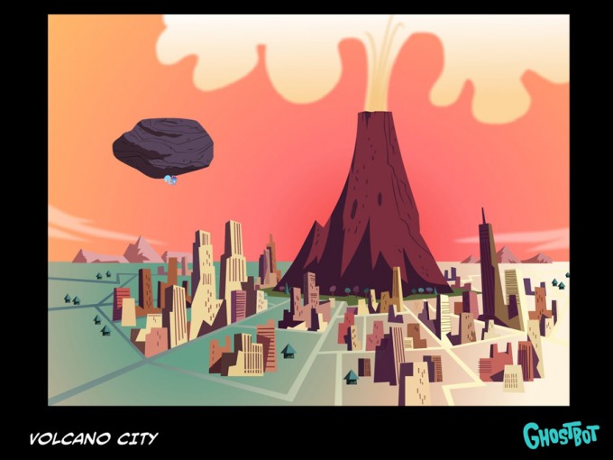
Unbeknownst to myself, Creative Director Dean MacDonald secretly designed this shield as part of some promotional art for Splendid's show. It was so spectacular (and shiny) that I asked him to design the final logo as well. I really wanted to make the name of the show something completely ridiculous, thus Splendid's Supremely Sensational Stupendously Spectacular Super Squad or Splendid's SSSSSuper Squad for short.
Since sound and music make up 50% of any production we don't trust anyone else but master Sound Designer Jim Lively and Composer Jerome Rossen to fill in the audio gap. True to their versatility and talent, they're able to sculpt the sound effects and music into super-heroic proportions!
If you're still un-satisfied and want to read about more Splendid exploits, Director Roque Ballesteros also has a blog about the whole experience from his side of the mask where he basically contradicts everything I've said here.


 Happy Tree Friends