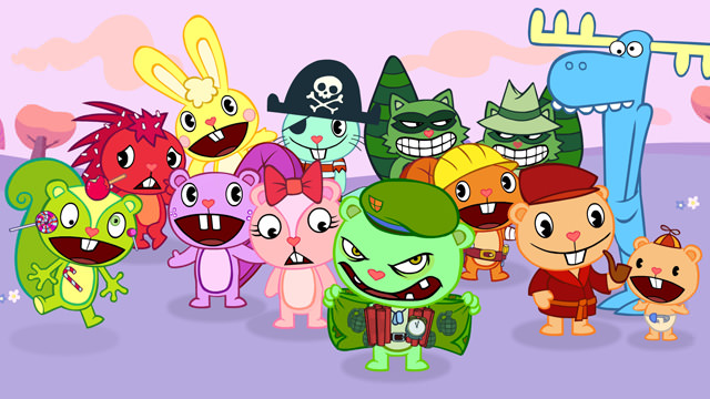

I know it's been a while since the original Burn After Reading post and even longer since the False Alarm game released but I wanted to provide at least some sort of closure about this topic in the form of a second blog post.
I had planned on talking about our trip to the Isle Of Wight to meet with the developers, Stainless Games, but thought it might be more fun to show you guys some development material that we generated here at Mondo to help the Stainless guys during the production of the game. A lot of this material is not just pertinent to the game but the show in general so, I thought some of you guys out there might be interested in reading/seeing some of this stuff.
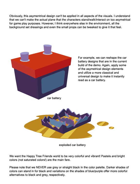
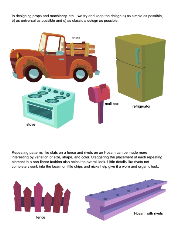
First, we talked about how we designed props and environments in Happy Tree Friends. It may seem pretty easy and straight forward but we actually spend a lot of time thinking and planning the approach to the design phase of the show. Initially, the Stainless guys were designing the levels and props as you would any other game, with true perspective and levels that all make sense in the real world. However, Happy Tree Friends is not the real world (at least that's what I've been told) so we have the artistic freedom to do anything!
The following are some notes about the "asymmetrical design" philosophy we employ for the show.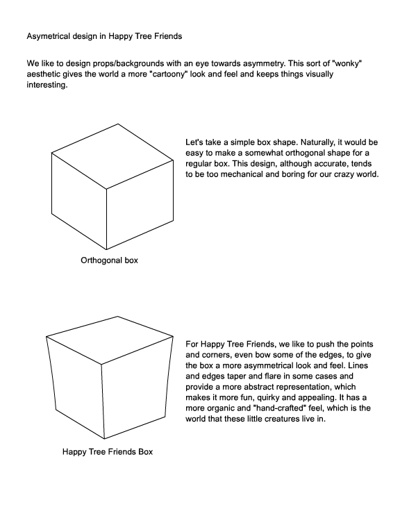
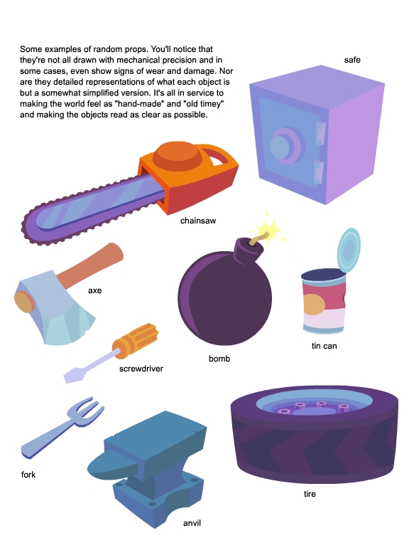
Another big factor for Happy Tree Friends that most people don't think about is color! It adds so much mood, texture and personality to each episode that we think of color almost like it's another character! It's also one of the more trickier subjects to tackle because it's so ambiguous and ethereal in nature.
To show you what I mean, let's do a quick exercise. Try to imagine that you have a friend, let's call him Tony Two-tone. Tony was born only seeing black and white, no color at all. How would you describe to Tony the color of an apple? What about the sun? The grass? The Ocean?
Color is tricky because it's hard to pin it down. Some colors work well with each other and some don't. There are guidelines that you can use but at the end of the day it really is up to the viewer to decide what "works" or not.
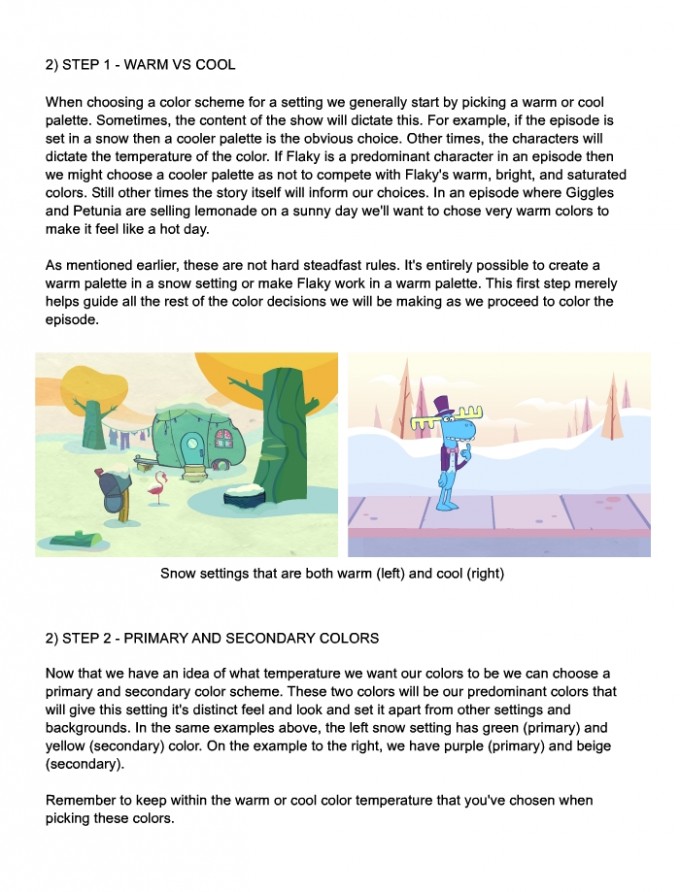
For Happy Tree Friends, there are a few guidelines that we try to adhere to as well. Like most things in the show, these rules are meant to be bent and broken in some cases but I wanted to give someone who is unfamiliar with the show a starting point on how to color the show.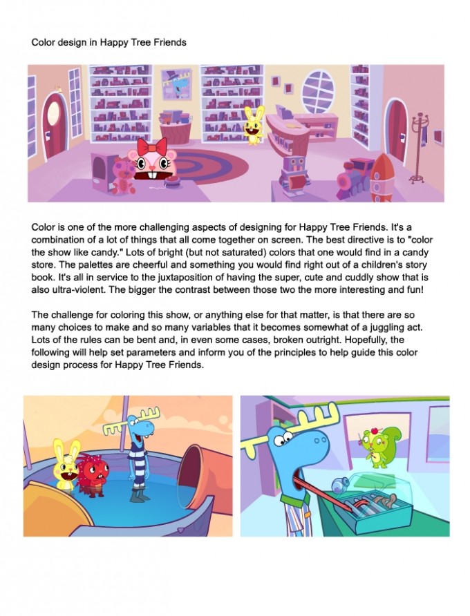
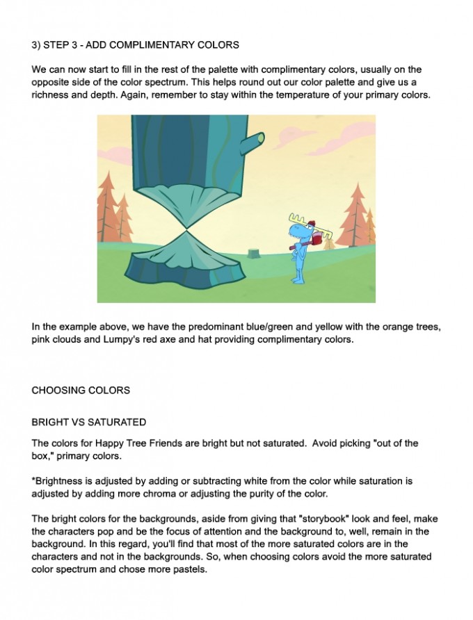
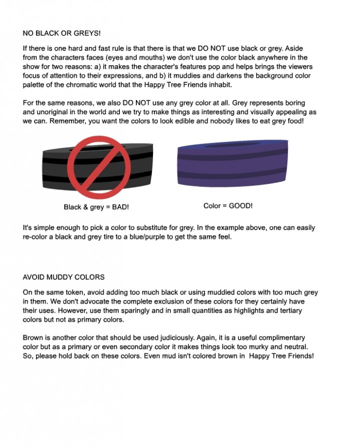
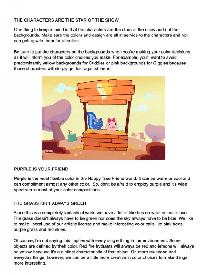

The last bits of material I have to share is more game specific. In one of the earlier versions of the game, we had Lumpy flying around in a one-man helicopter rig that the player controlled rather than a floating cursor that was in the final build. I provided Stainless a design for what that contraption would look like: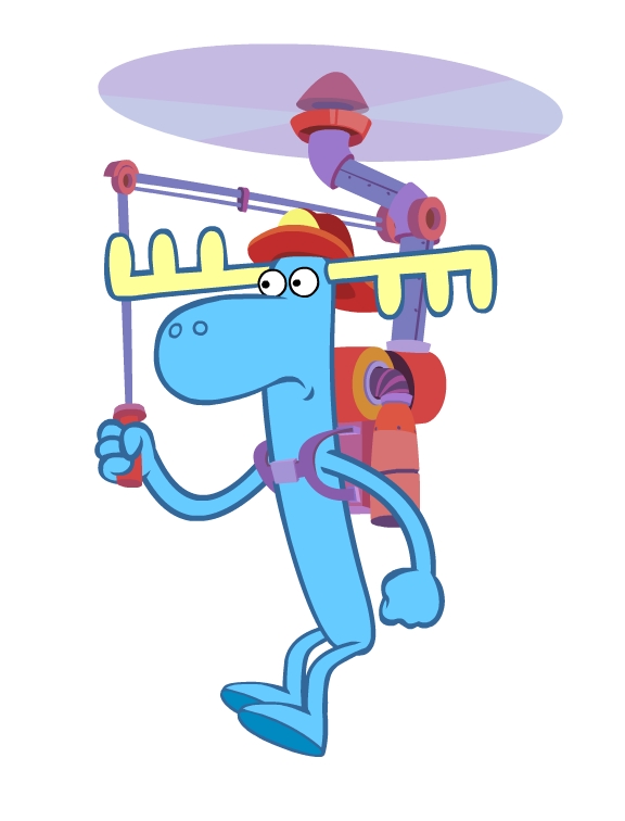
Ultimately, it wasn't used but I still think it's a funny looking machine.
These last set of images are of level designs and some game mechanic ideas that I thought would be fun to employ in the game. They also provide some color inspiration and design examples of how it all comes together. As with any type of design production, some of these elements made it in the game and others didn't. If you want to see a larger version of these levels just let your mouse do the walking and click on it!


T-t-t-t-that's all for now, folks!


 Happy Tree Friends

